 |
|||
| layout info |  | ||
|
Click on the thumbnail for a larger version. 


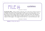
Version 3.0, inaugurated with the new domain name. Tables again. And again, Genghis from Can't Sleep, Con Will Eat Me, an online manga I draw and write for. This is Evil Genghis. If you see him this happy, you should be Very Worried (I tend to throw Can't Sleep characters on my webpages because I've got lots of sketches of them lying around when I get in the mood to redo webpages). My main page and pages dealing with the site as a whole (metapages) all look like this. Each individual section within the whole takes a different look, because each has a different focus and audience. And, of course, because I get bored easily and like changing things. The art page (third from the left above) is done entirely without images, a bit strange for an art page, but it suits my sense of the absurd. The colors are all background colors in table cells. Each subsidiary page is primarily white, with a title bar that is the color of the cell which links to it from the main art page, to tie them together. 

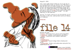
Version 2.0, after I got tired of my very first layout, which I don't seem to have a picture of. You're not missing much. This was the last time I attempted to make my pages look consistent throughout the whole site - it was a major pain to update everything every time I made a change, and each section is pretty much internally self-consistent and has a different audience. So, modular it became with the next version. The guy on the front page is Genghis, from Can't Sleep Con Will Eat Me, an online manga I do with a couple of other people. He's in an uncharacteristically pensive mood here; he's really more likely to look bitter and ticked off. |
|||
 | |||